EVBox
Rebrand, website redesign, design system
2023
Setting the scene
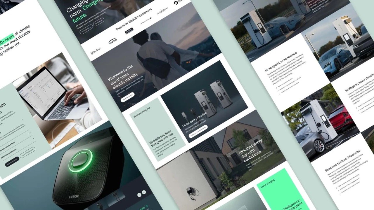
I managed websites at EVBox for 2 years. In 2023, the company went through a rebrand. As part of that, all websites had to be redesigned, and we only had 4 months to do it.
I was tasked with leading that project. In April 2023, we launched the new websites and throughout the rest of the year, we fine-tuned it.
Looking back at this project months later, I wanted to document the process and my learnings for future reference.
Company background
EVBox is an electric vehicle (EV) charging solutions supplier headquartered in Amsterdam with 700+ employees and over a decade of experience in hardware, software, and services.
This rebrand executed in 2023 was the first in the history of EVBox. If you’re interested, you can read more about the overarching rebranding process.
Step 1: Setting up the team
The first step was to set up a project team able to execute this website redesign in such a short timeframe.
So in December 2022, I started looking for a senior UI/UX designer able to take the design lead. After going through 150+ candidates, I came across Sander, and after a first interview I was sure I’d found the right guy. Luckily, Sander was keen on taking on the challenge. A few weeks later, we met at the EVBox HQ in Amsterdam and rolled up our sleeves.
While onboarding Sander, my next mission was to determine how to structure the development. We already worked with the web agency Sterc at EVBox and they knew our setup very well so it made sense to combine forces. We hired 3 developers and a part-time technical lead.
Combined with our internal team, that meant the project team consisted of:
1 product owner (me)
4 developers
1 technical lead
1 copywriter
1 design lead
1 junior designer
1 intern
Next to the project team, the delivery of this project required close collaboration with several key stakeholders:
Brand team: defined the new visual identity and voice of the brand. We collaborated closely in the first few weeks of the project to ensure that the new website design matched the vision for the new brand.
Product marketing team: defined the new value propositions and copy matrix for each product. We works very closely when redesigning the product pages.
Regional marketing team: responsible for localizing and implementing local website changes. Because all EVBox websites are multi-lingual, the regional marketers were key to ensure we were able to launch the redesigned website across all the locales.
3D studio: as part of the new designs, we required new lifestyle renders and 3d product renders for each product which required a lot of iteration, brainstorming, and joint-planning to ensure timely delivery.
Step 2: Defining scope & requirements
We had a hard deadline to launch the new brand in April 2023. That gave us 4 months to execute the website redesign.
Given our limited resources, we agreed on a minimum viable product (MVP) website launch in which we separated what needed to be completely redesigned versus just restyled.
PRD
After taking the Reforge product management course, I was convinced in the usefulness of requirement docs (a.k.a. PRDs).
I created a PRD for the overarching project and then for each key page. This worked really well for us. You can find my personal template here.
Redesigned
Navigation
Homepage
7 product detail pages (PDPs)
3 product listing pages (PLPs)
Product overview page
About page
Career page
Blog subdomain
Newsroom subdomain
Restyled
All the other 2,000+ pages on the evbox.com domain had to be restyled for the MVP launch to match the new brand elements (font, color scheme etc.) and then redesigned later throughout the year.
Design system & design tokens
Prior to starting this project, we did not have a website design system. New designs were just created ad hoc in Figma without a central reference. Hence, setting up an atomic design system with design tokens was a key requirement for us to move fast.
Creating the design system in Figma was a game-changer. It made design work a lot faster and drastically improved the collaboration between the developers and designers. We set up the design system documentation in Zeroheight.
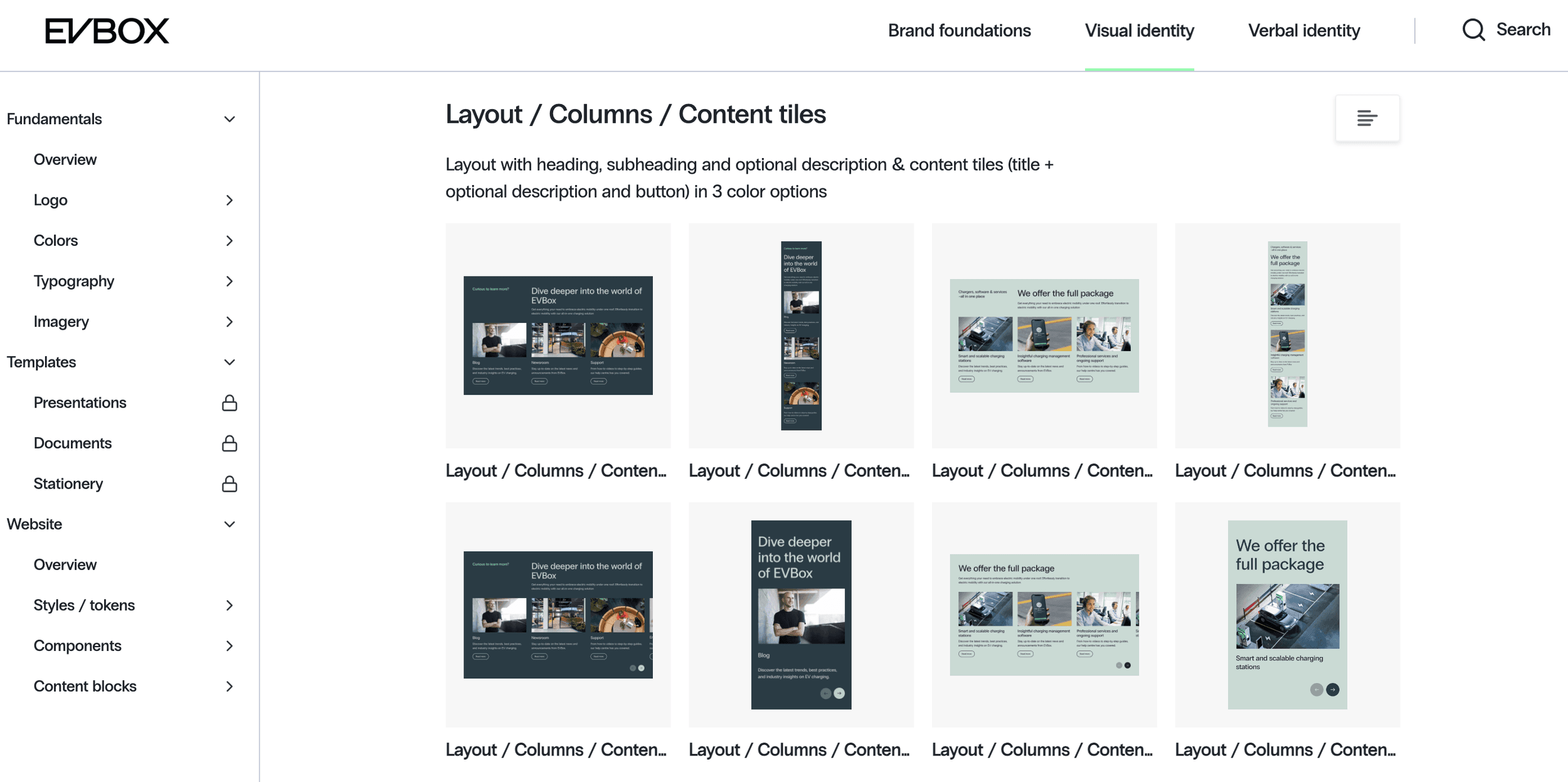
The decision to implement design tokens was more dubious. It took a lot longer than expected to set up, and while we reaped the benefits 3 months in, it cost us a lot of time.
The value of design tokens mostly lie in the use across departments and applications (for example if used in websites, apps, and internal platforms).
However, only we ended up using the tokens which limited the benefits. Had we known this in advance, we would not have implemented the tokens. As the saying goes, everything is obvious in hindsight.
We agreed upon and communicated a standardized naming convention for all the design tokens, components, content blocks, and templates. That meant we used the same naming in Figma, our CMS, and everywhere else.
Starting from scratch approach
Due to our heavy tech debt with our previous MODX setup, we decided to start the redesign work on a new environment on MODX. This enabled us to adopt an improved tech stack and improve core site performance.
However, due to the large amount of legacy integrations, custom code, and ad hoc pages, the migration of content from the old environment was a bit of a mess.
I think we made the right decision but we could have managed the migration planning better. We definitely underestimated the effort involved in this.
Step 4: Copywriting
During the design process, the copywriter was heavily involved in giving feedback. Design and copy go hand in hand so this was key to ensure the page layout and content blocks met the copy requirements.
For each redesigned page we created a master copy spreadsheet (in English) with all the copy neatly ordered according to the page structure with the content block names.
The copy was shared with the primary stakeholders prior to the design review for feedback, refined together with the final designs and we aimed to finish off the English copy for each page together with the design so that we could hand it over to localization.
Step 5: Technical setup & migration
The technical setup of the new CMS environments and content migration from the old environments was something we severely underestimated.
What we thought would take a few days took nearly 3 weeks and an extra backend developer to do.
The reason was that there were a lot more hidden dependencies and ad hoc pages than we thought. This should have been mapped better but we also lacked previous documentation which made this very hard.
The frustration of this stage caused a lot of stress among the team and ate away at our buffer time. I did my best to stay calm which I think in turn helped calm down the team.
Step 6: Development of new content blocks
In our MODX environment, we worked with 3 different environments:
Staging: used for development testing
Preproduction: used for content implementation
Production: live website
The development phase of the project included the following:
Develop all the new content blocks using the new tech stack.
Develop the new main and footer navigation.
Rebuild the old content blocks to make them match the new branding.
The development work for each content block involved the following steps:
Refinement based on (Figma) design
Develop backend of block
Develop frontend of block in staging
Design QA (by designer)
Functionality & CMS QA (by me as Product Owner)
Deployment to preproduction
This phase of the project was the more stressful. We underestimated the effort involved in developing the content blocks but even more so the top navigation and the implementation of design tokens.Developing the top navigation ended up taking 4x as long as we expected with 5 feedback and QA rounds.
Implementing the design token system also took a lot of time in the beginning to define and set up which bottlenecked much of the content block dev work.
A key learning for me here was to carefully evaluate the pros and cons of high impact decisions like using design tokens and if proceeding with such a decision, then meticulously map out the predictable bottlenecks and dependencies.
That being said, it all worked out in the end. When we realized things were going too slow, we made a good call to add another dev to the team from the agency which allowed us to make it in time.
Note: I coordinated the dev work for the subdomains (blog.evbox.com and news.evbox.com) with other agencies but that was much more straightforward given the lower complexity of those sites.
Step 7: Content localization
At the time of this project, evbox.com was a multi-lingual site with 12 different locales, each with a different product offering and set of pages.
Hence, it was not a question of translating but truly localizing the content.
This is where our regional marketing team came is. Their support was critical to the timely launch of this project.
I coordinated the localization process in our website localization Jira board. It was split across 3 sprints (6 weeks) in batches.
Step 8: Asset creation
This project required us to completely rethink our visual identity. Personally, this was one of my favorite parts of the project.
As part of the rebrand, the brand team had coordinated two comprehensive lifestyle photoshoots featuring two of our new products. This was our (limited) visual foundation.
From there, we started mapping out what was missing.
One thing we all agreed on is that we needed a “wow” factor on the website that would set up apart from our competitors. This is where the idea of scrolling animations on the product detail page came in.
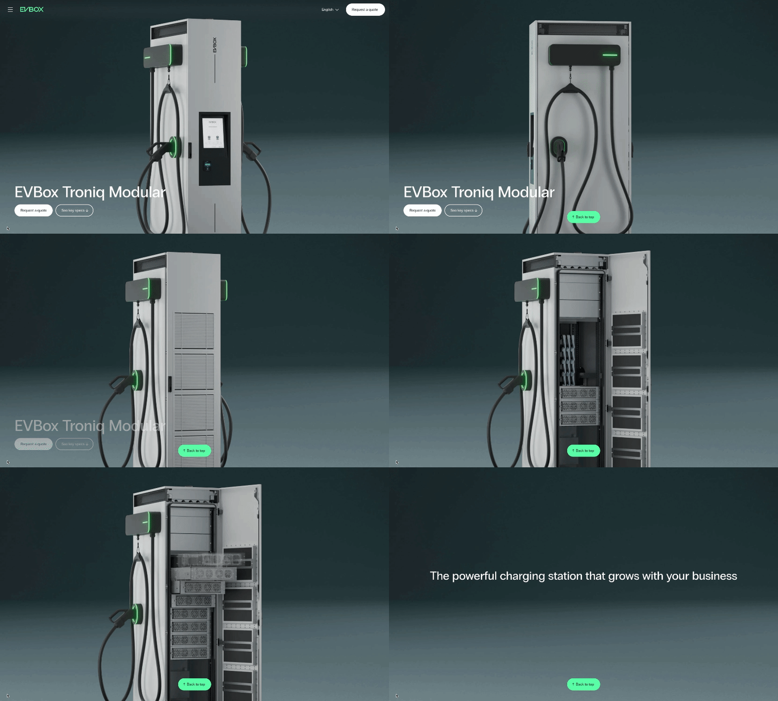
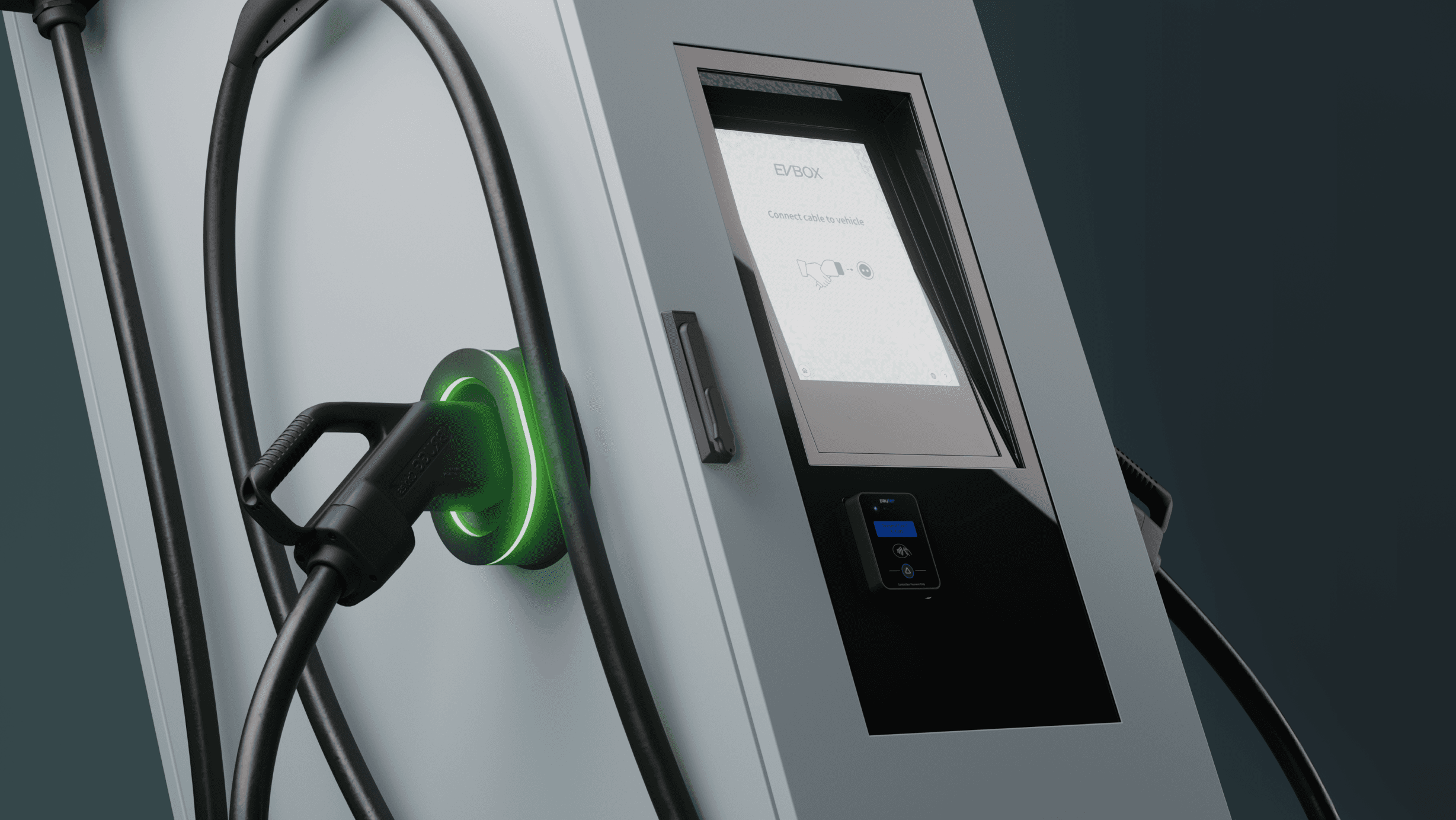
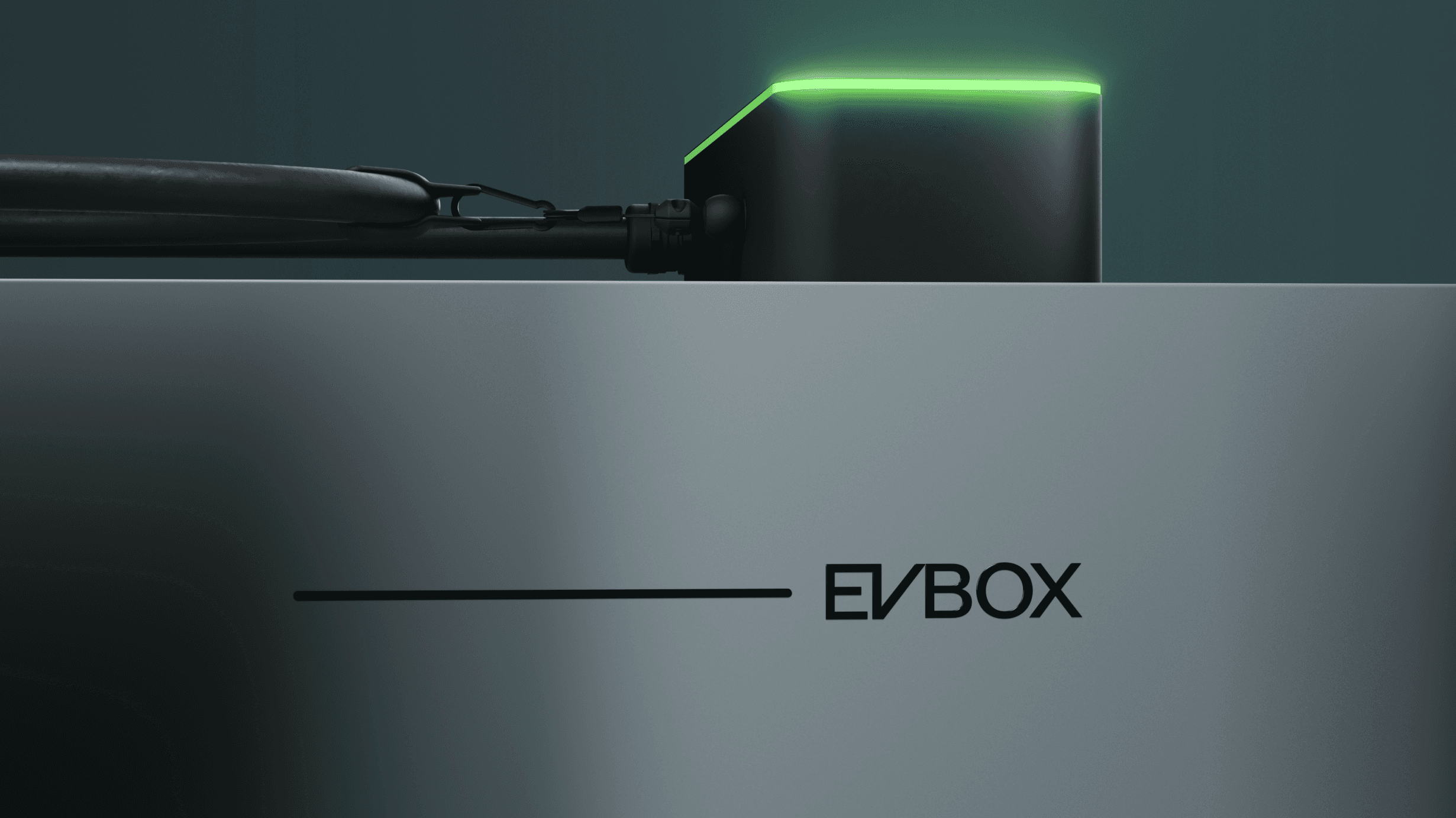
Next up, we needed product imagery. Because we had no product photography, we had to go for renders. Luckily, we worked with an agency agency, Art Binary, that delivered some amazing renders, for example see the EVBox Liviqo page.
Step 9: CMS setup
Putting everything together in the CMS took a ton of work, and required all of my weekends during the last 2 months of this project.
However, the result was worth it. With the new environment and tech stack, we had completely restructured our MODX setup and way of working, which was now a lot more efficient.
The process for each batch of pages looked like this:
Website team sets up pages on International locale
Jira ticket is assigned to each regional marketer with local implementation instructions
Once local implementation is done, website teams reviews the setup
Step 10: Restyling legacy content blocks
Next to the complete redesign of the key pages which involved the development of a new navigation and many new content blocks, we also had to make sure that the content that we migrated over from the current site (to be redesigned later throughout the year) also matched the new branding and website design.
This was critical to avoid a jarring website experience.
This part of the project was also severely underestimated. We thought we could get away with just changing the font and a few colors but when we got started with this, 1 month before launch day, we realized it would not be that easy…
We ended up redesigning large chunks of almost every content block and getting an additional developer to help out redeveloping them.
Out of many, one key thing we overlooked was that the width of old blocks was different from new ones and since we had modified the grid, this became very jarring…
In the end, this extra effort was worth it because in the end, the restyled blocks looked very compatible with the new ones. Had we just changed the font and colors, it would definitely not have been the same thing.
Step 11: Quality Assurance (QA)
Due to some of the oversights and complications explained in the previous step, we had burnt most of the buffer time I had planned to dedicate to QA. Luckily I had planned as much buffer time as possible…
Like with most parts of this project, QA was done is stages but the last week we fully dedicated to finding and solving as many bugs as possible. And there were a lot...
After a first round of review on our preprod environment once all content was in palce, we had compiled a growing list of 100+ bugs.
That last week was crazy. All hands on deck. We managed to solve all high and medium priority bugs. The small ones were prioritized in the backlog to be picked up in the first week post-launch.
Step 12: Launch
At 9am on April 25, 2023, we flipped the switch on evbox.com, then blog.evbox.com, and finally news.evbox.com. We found and solved several more bugs throughout the day but all things considered it was a very smooth and successful launch.
But in many ways, the April launch was just the start. We had lots left to do. In particular, we had 100+ restyled webpages left to redesign.
This is something we planned and achieved throughout the year. When I decided to leave EVBox at the end of 2023, we had redesigned everything and I felt that there was not much else for me to do. It was time for another challenge.
Following the launch of the rebrand, the team wrote a story about it and created a cool brand movie.

