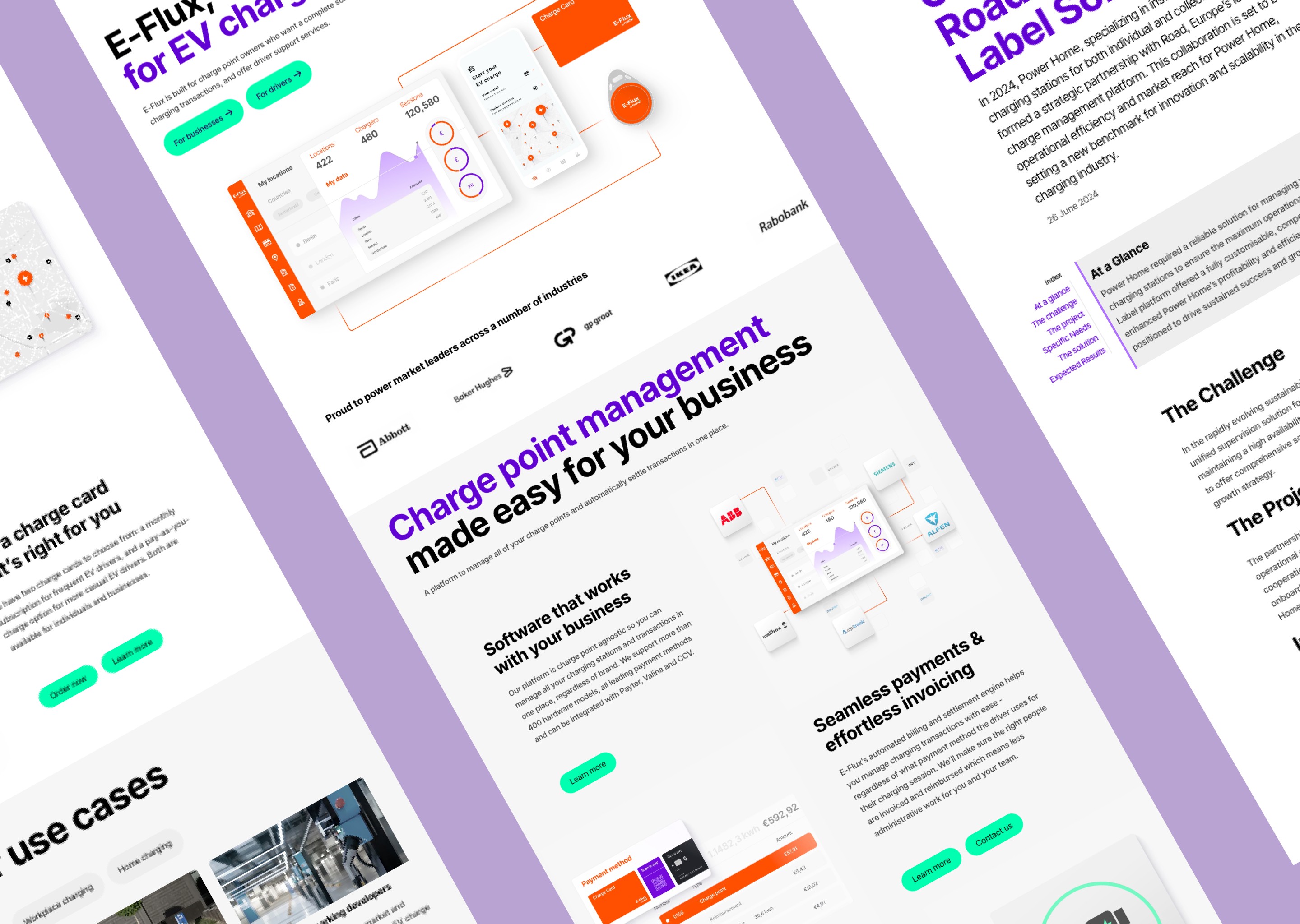
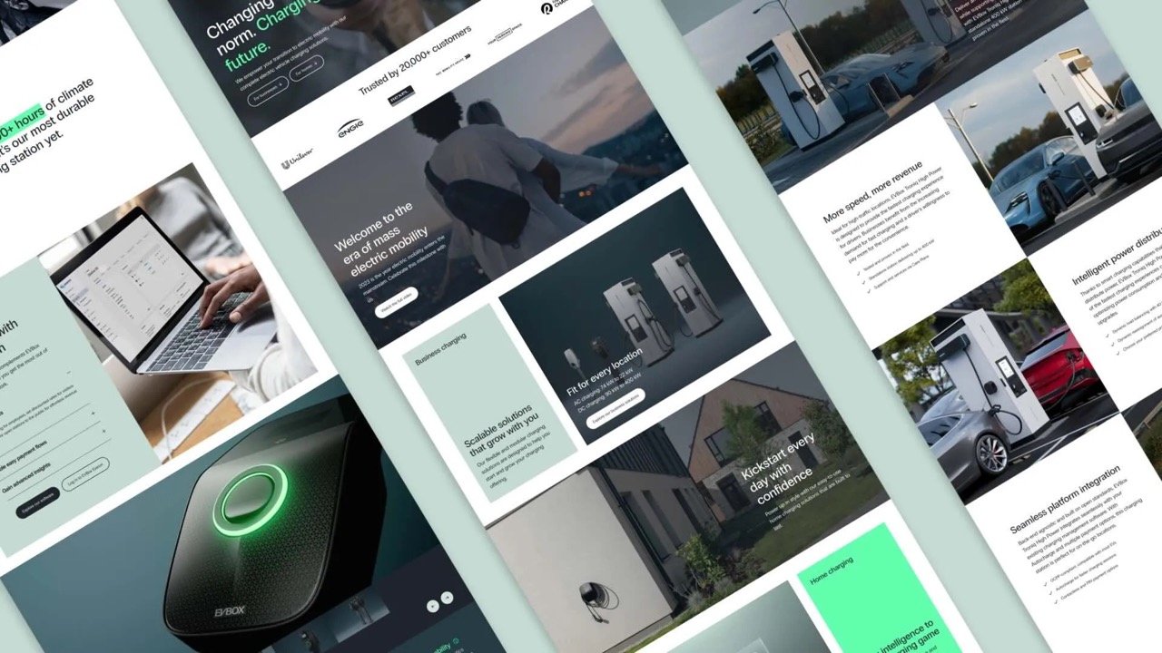
E-Flux
Website redesign, design system, CMS migration
2024
Setting the scene
I joined Road at the start of 2024. The company had just rebranded and needed to redesign their e-flux.io website for two main reasons:
Outdated and inconsistent design, no longer matching the new brand
Lots of technical debt and unreliable tech stack
This meant that not only a complete redesign of the site was needed but also a migration to a new tech stack and CMS.
Company background
Road is an EV charging platform provider for companies across Europe. They offer a ready-to-go platform (E-Flux by Road), a white-label fully customizable platform (Road Private Label), and EV charge cards.
Step 1: Setting up the team
When I joined, the team was already in place which helped speed up the process a lot. The project team consisted of a mix of internal experts and web experts from YourMajesty, the agency we worked with:
1 product owner (me)
1 technical lead
1 developer
1 copy lead
1 copywriter
5 regional marketing experts
1 design lead
1 animation designer
Next to the project team, the delivery of this project required close collaboration with several key stakeholders:
Growth marketing team: ensured seamless integration with all touchpoints.
Brand team: defined the direction of the new visual identity along with the agency.
Product marketing team: refined the value props and copy matrix for each product, segment, and use case.
Regional marketing team: responsible for localizing the website.
Step 2: Defining scope & requirements
A complete redesign of e-flux.io was in scope. However, this can mean anything and everything so we had to put some constraints:
New design system with +- 30 modules
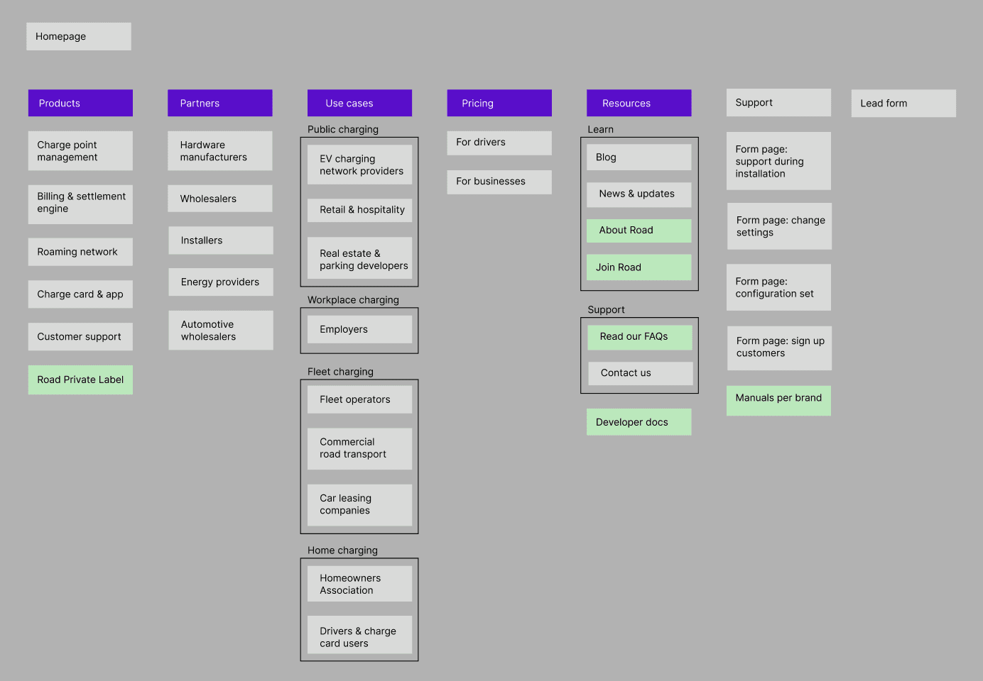
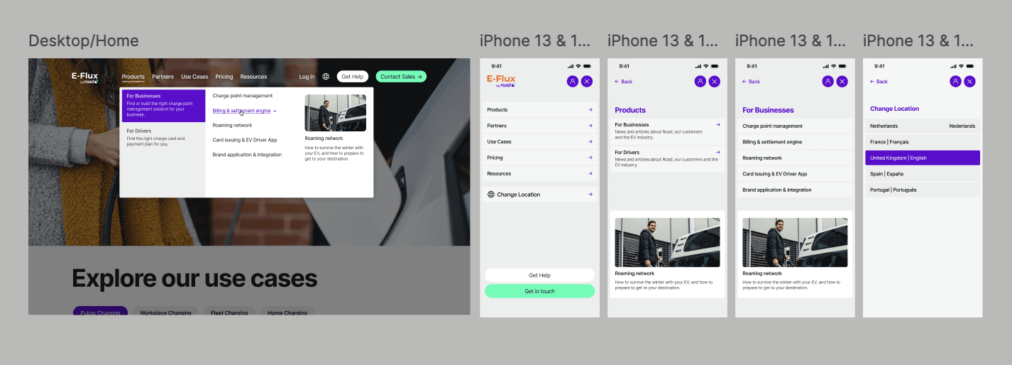
New mega menu navigation
Create +- 10 use case pages
Create +- 5 partner pages
Redesign all other existing pages
Create +- 10 core animations
Create a stylized library of product assets
Migration from WordPress to Storyblok CMS
Migration from Gravity forms to Jotform
Migration from old to new hosting provider
Anything not included in this list was deemed out of scope. I captured this in a requirement doc (PRD). P.S. You can find my personal template here.
Step 3: Design
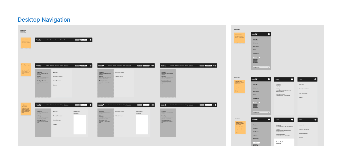
We started by creating wireframes based on the requirements. After a few feedback rounds, we had nailed down the core flows and UX decisions for the navigation, homepage, product page, partner page, use case page, and pricing page.
Once we were happy with the wireframes we moved on to creating the prototypes. Assets were only created later once the final copy was signed off.
Step 4: Copy
From there we created a first copy doc draft. The agency were only responsible for writing the copy for a few key pages that would serve as reference. The rest of the copy was written by our internal experts and localized in batches.
Step 5: Technical setup
During the design process, we prepared for the CMS migration. I audited and cleaned up our WordPress account and made a migration checklist.
Together with the technical lead, I then set up the new Storyblok CMS to match our technical requirements.
Step 6: Development
Once the designs were signed off, we proceeded with development. This included creating +- 30 custom modules (including variations), the mega menu navigation, and some custom Storyblok integrations like Google Sheet 301 redirect & href alternatives docs.
The development & QA went very smoothly. It took just about 1 month.
Step 7: Asset creation
Initially we planned to stick to static assets but in the design process we realized animations were necessary to bring the site to life.
This change in scope ended up delaying the launch of the project by a few weeks but it was a conscious and weighted decision that was worth it.
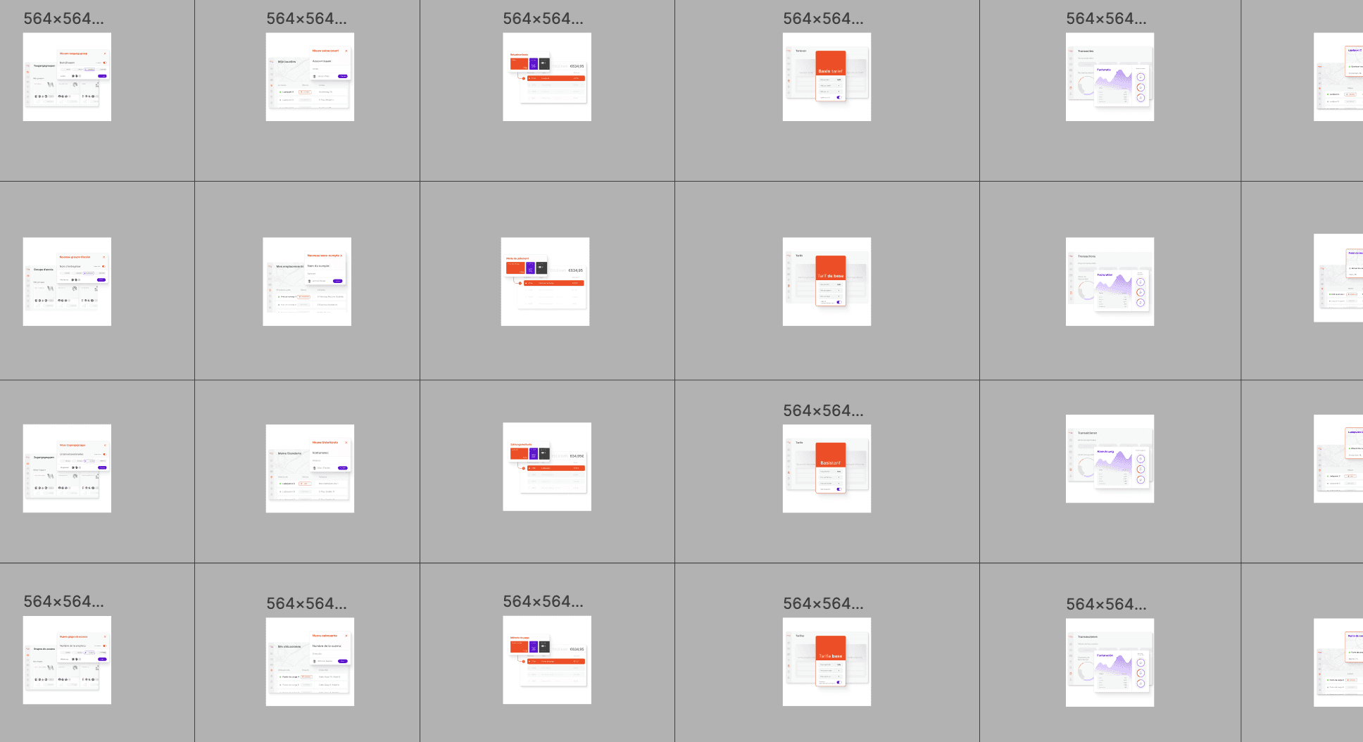
Our agency created 8 stylized product animations used throughout the website. Using those as visual references, we internally created the remaining 100+ assets that we needed for all pages across the website.
Step 8: CMS setup
As always, putting everything together in the CMS was a ton of work. I set up the International website locale and then the regional marketers duplicated it and set up the regional locales.
One learning for next times is to only do this duplication & localization effort when the International (or reference) locale is fully done.
I ended up spending a lot of time going back and making a bunch or large and small changes across all locales throughout the QA period.
The last piece of the puzzle was to localize all the product assets and then implement them across all locales. Having a clear naming convention and file organization in the CMS was key to make this process efficient.
Step 12: Launch
On May 14, 2024, we flipped the switch on e-flux.io. The launch was very smooth.
For a week post-launch we were fully focused on collecting feedback and fixing all top-priority bugs (around 110).
The general feedback was super positive both internally and externally. The site performs much better, is more user-friendly (particularly huge improvements non mobile) and user-centric, is a lot more stable, and has a much more scalable structure.

